The Concept
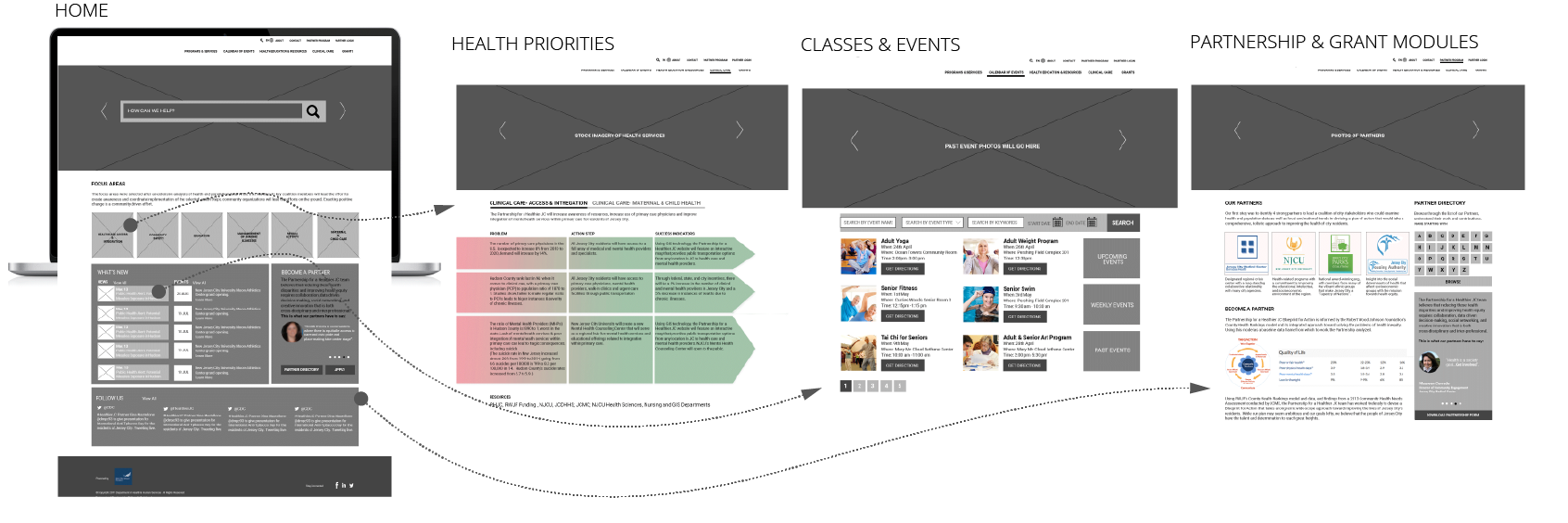
A city website to cater to residents by creating a repository of resources, events and integration with service providers. A platform aimed to promote memberships, collaboration between local business and NGOs with bigger conglomerates. Three main modules to be integrated – Partnership, Events and Grants.
For example, members could upload new events, host and promote them. They could get access to grants, to which they could apply for to spread their business. Discovery sessions during workshops became the primary information source.
DISCOVERY
STAKEHOLDER INSIGHTS
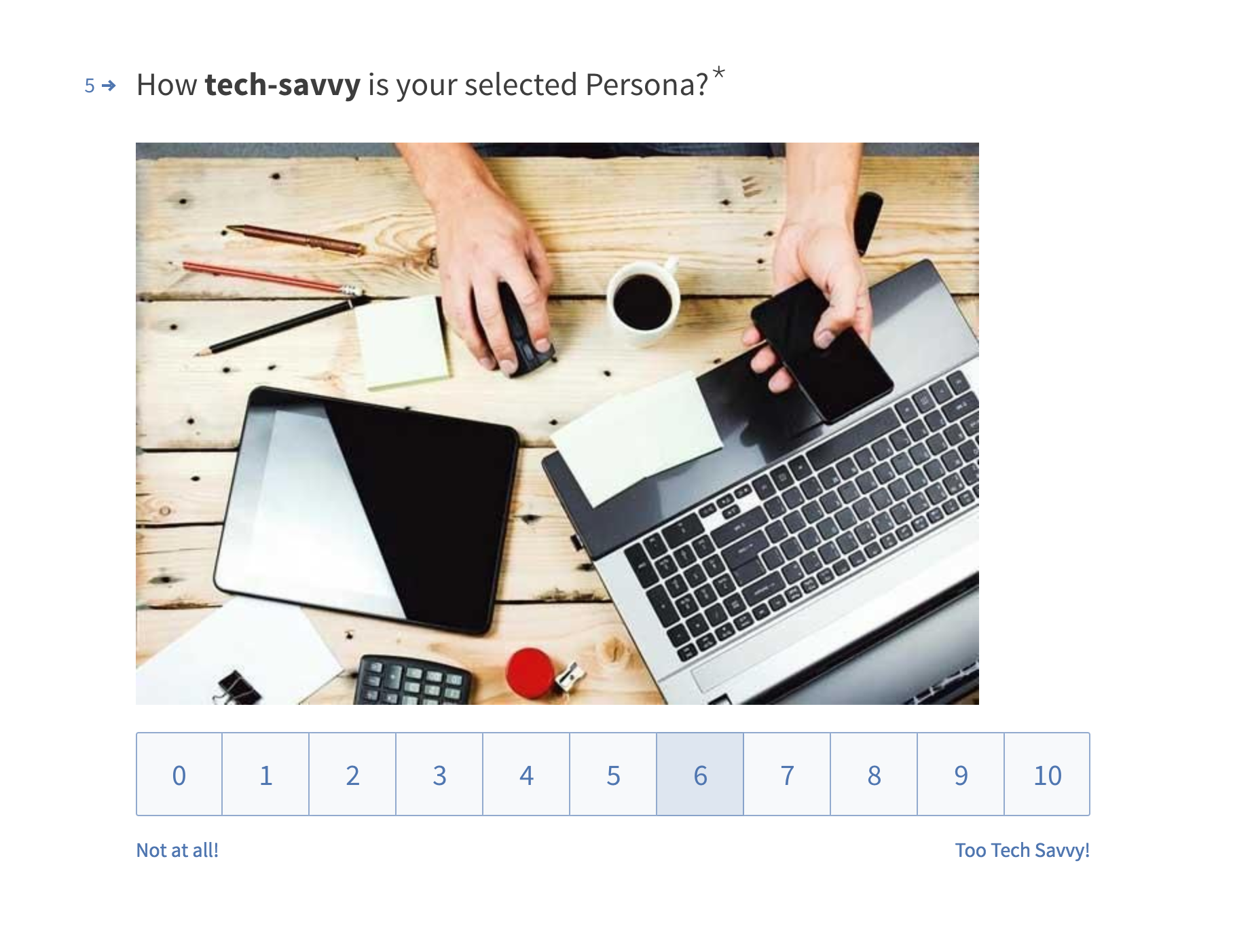
Using online survey forms important information was gathered regarding the requirements for both the users and the stakeholders. These were further supported by task analysis at a later stage while sketching.
High level goals and objectives of the site:
- a platform for residents to access healthcare services
- an interface for service providers to plan and coordinate events
- integrate transportation with a myriad of services
- create a modern, intuitive, responsive experience
- centralize social media communications
INFORMATION ARCHITECTURE
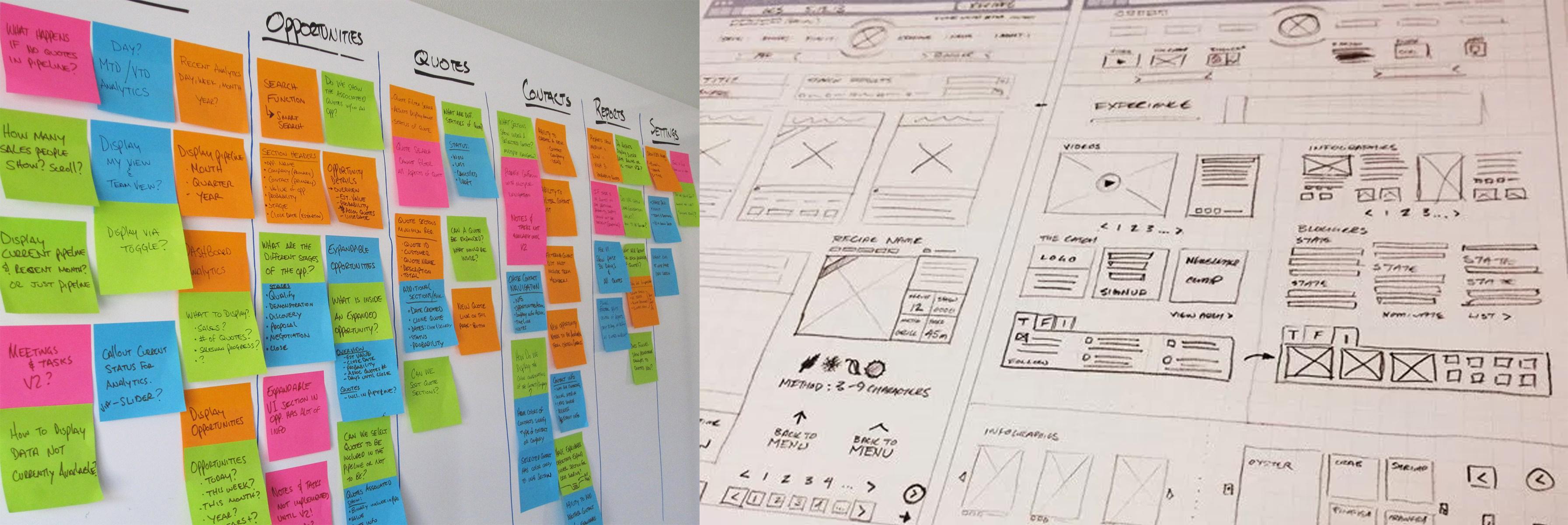
Card Sorting & Sketching
Wireframes and Annotations
USER INTERFACE
HOMEPAGE & STYLEGUIDE
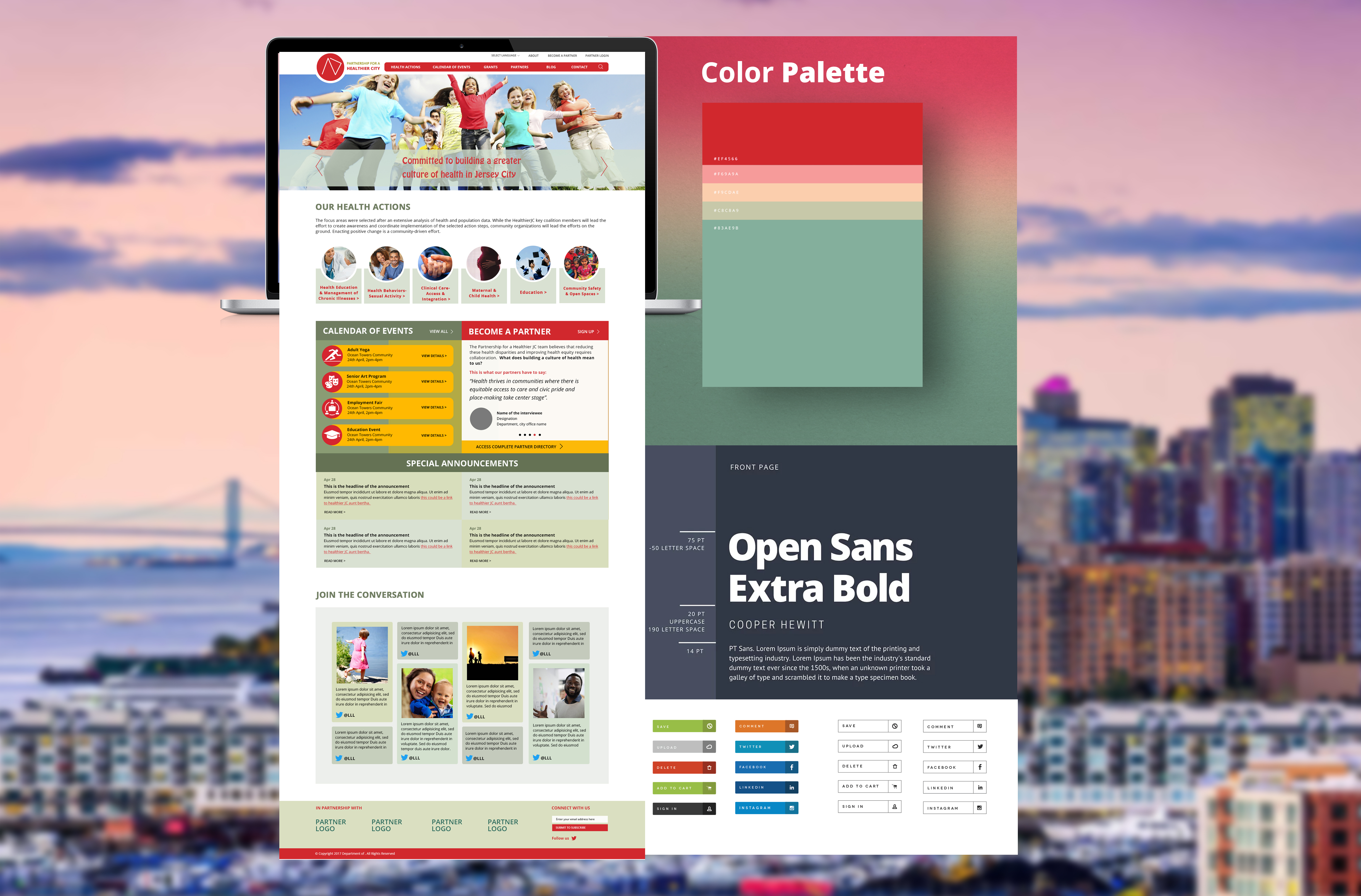
Integrating user interface elements came as a natural step for this exercise, as the decision was made to test the designs in their closest form. Some key element decisions made during this process were regarding:
Colors: Warm color palette that resonates with the brand color Red is used. Supporting colors such as mustard yellow to do highlights, and subtle pastel greens to make background panel colors.
Typography: Sans-serif web safe font – open sans is used in varied font weights to create stress content areas.
Imagery Selection: Images selection is based on more naturalistic people photography. Also shots of the neighborhood to establish a relatable user interface.
CTA Styles: The button styles and call-to-action are stronger, rounded and based on the color selections made above.
Movement : Movement is introduced using subtle animations in buttons, parallax, and banner videos.
Key learnings

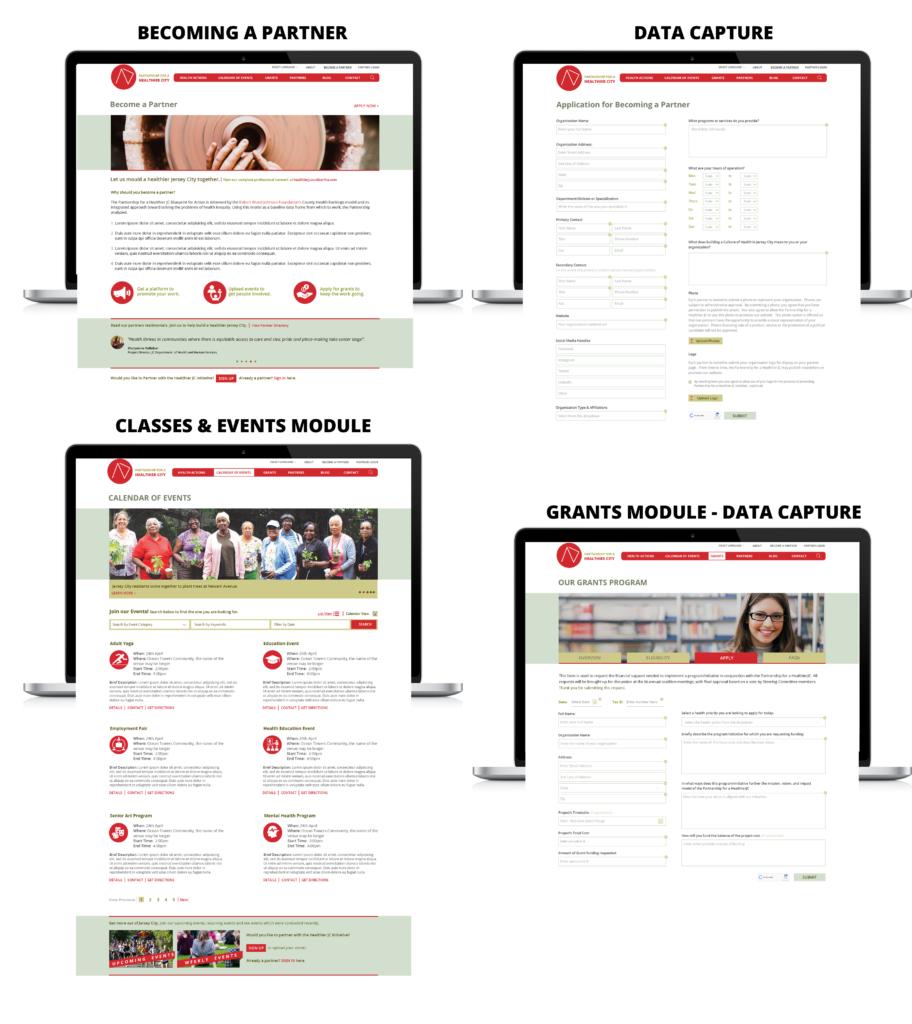
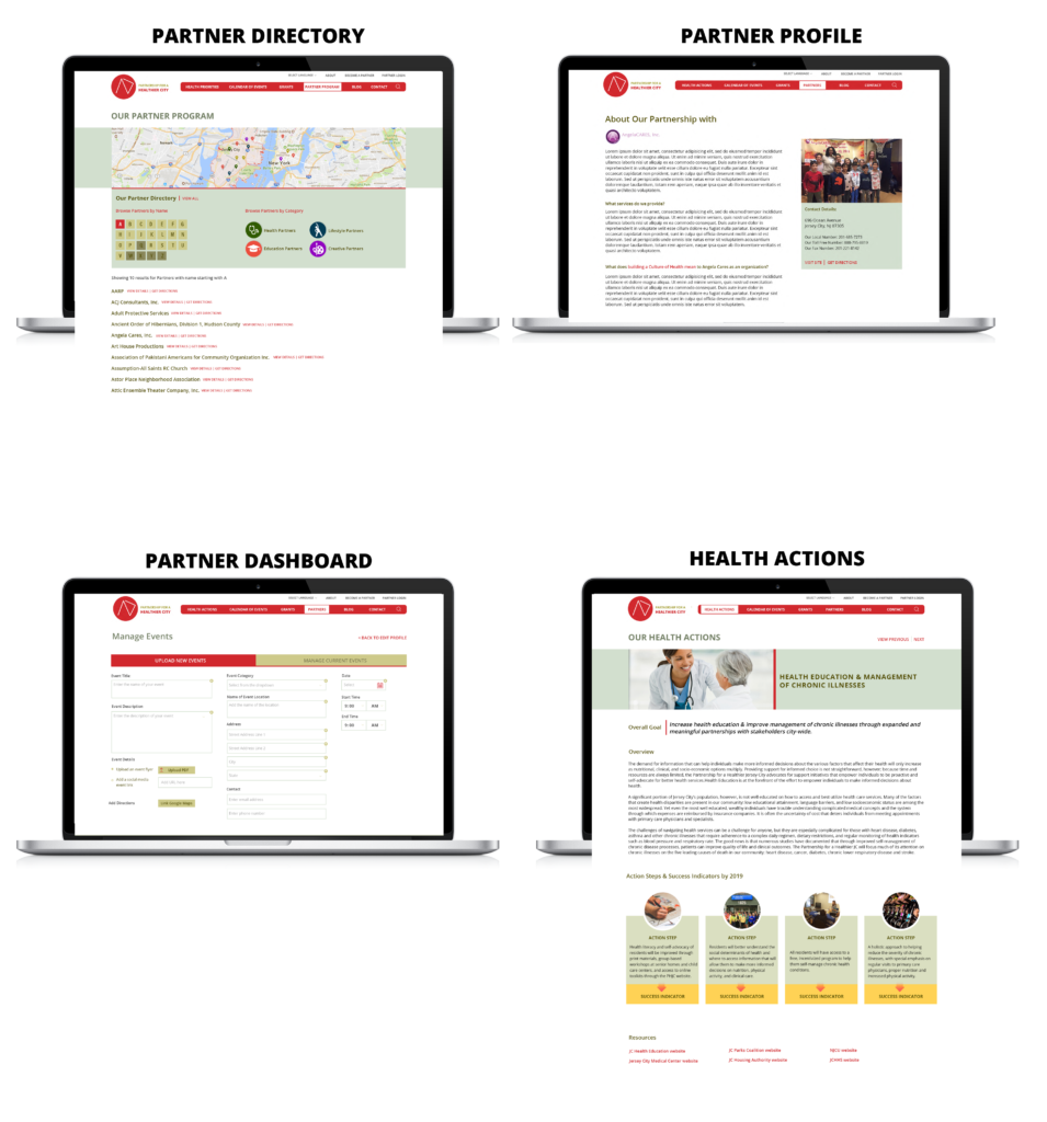
The project is a great example of what a usually content heavy website is looking for. The answer lies in the overused words of ‘intuitive navigation’. By cutting down on the dropdown elements and integrating more landing pages with internal links, a clean IA was established.
A key observation was also made regarding the knowledge of balancing colors with the right audience. Using warmer colors, helped establish a quick rapport with a diverse city audience. More people engaging with the content means a healthier happier community.